Do Good Logos Need to Actually, You Know, Look Good?
The definitive book on corporate branding makes the case that successful companies have successful designs—but the relationship between those successes remains mysterious.
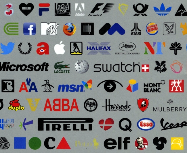
There are good logos and there are bad logos—who can tell the difference between the two? Per Mollerup, an economist whose Scandinavian visual communications firms Designlab specializes in corporate identities, had made his own mark doing just that. For more than a decade and a half now, he has sifted through the mass of vintage and novel trademarks to distinguish stellar design from a badly rendered mark, compiling the results in a hefty tome, Marks of Excellence: The History and Taxonomy of Trademarks (Phaidon Press). First published in 1997, the go-to guide for logo makers and their clients has undergone a handsome revision, featuring a staggering 500 new marks, for publication next month. Glancing through its pages raises the question of not merely what makes good or bad logos, but of how much logos matter at all—the eternal question of whether design and branding really affects a company's bottom line.
Mollerup develops corporate identities for a living, so he has a stake in the field's reputation, but the book offers a fairly even-handed analysis of historic and contemporary visual marketing efforts. He told me he began this project because he wanted to understand more about what is today known as the "branding phenomenon" that his own company was contributing to, adding "I did not get that understanding from existing books." When he began in the mid '80s "we did not talk about branding with our clients. They looked at branding with deep disbelief ... Today there is a much wider understanding and acceptance of branding."
There's also a lot more jargon about it. In fact, one of the important differences between the 1997 and 2013 editions revolves around language. Mollerup states in the book that trademarks "constitute a lingua franca," but in the time since the first volume, the vocabulary, he told me, "has got thousands of new words. There are more marks and a great variety of marks, as well as more classes of owners. Design literature in general has a tendency to look at the top of an iceberg. As implied by the title, Marks of Excellence shows a biased picture of what is out there."
Nonetheless, "excellence" is a loaded term. Of the logos featured in the book, is Microsoft's logo "excellent" because the design is impeccable, or because consumers recognize it in an instant? Is Harrods' script "excellent" because it is old, or for aesthetic reasons? Is Chiquita Banana "excellent" because it deploys a dancing banana and we find her cute? And is Ray-Ban "excellent" because of all the fashion advertising buzz that has built its rep? Mollerup's response: "Well-designed logos are the work of the designers. Successful logos imply the company's use of the logo." In other words, there are instances where a logo is not pleasant to the eye but the company uses it well. "A certain measure of ugliness is attractive in some trades," Mollerup explains, "A mediocre logo in terms of design quality can be used to good effect through a great mix of consistency and variation. The Coca-Cola logo is not, and never was, an outstanding design. However, it has been used with great ingenuity."
In case "excellence" is still too vague, he also includes a short section on "Branding for Skeptics." And I'm one of those. "The cure against skepticism is knowledge," he told me. "Rather than a mystery, branding is a bunch of healthy principles. Many of these principles were previously known without or with another name." Successful brands are cited throughout the book, and the majority do represent successful companies, which raises the question which came first: the brand's success or the company's?
"There is no chicken-or-the-egg situation," Mollerup says. "A brand is built around a core, which together with its presentation and the resulting image, constitutes the brand. Without a core there is no brand. The core can be a company, product, event or anything else." But a logo can be a little more mysterious.
Enter what Mollerup calls the "Found Mark," which is a figurative mark that previously did not have an obvious connection with what is branded. "'There is no real reason that a computer company should have an apple as logo," he says. "As time goes by the meaning of the logo becomes the company. Paul Rand, the designer of logos for IBM, Westinghouse and UPS, told us that he designer designs the logo while the company makes it."
Mollerup's most interesting section is where he shows an array of lookalike or copy-cat logos. Can this really be "excellence"? "Definitely," he says. "Identity has two dimensions: one is similarity, the other is diversity. You want a whiskey to look both similar and different to other whiskeys. You wouldn't buy it if it looked like drain cleaner. On the other hand, it should stand out from competing brands."
To the uninitiated, a page of Marks of Excellence may come across like a chaotic abundance of signs. But as a creator and student of the field, Mollerup muses as he looks through his book that "I see it as a plurality, many designs that serve many purposes in many different ways."