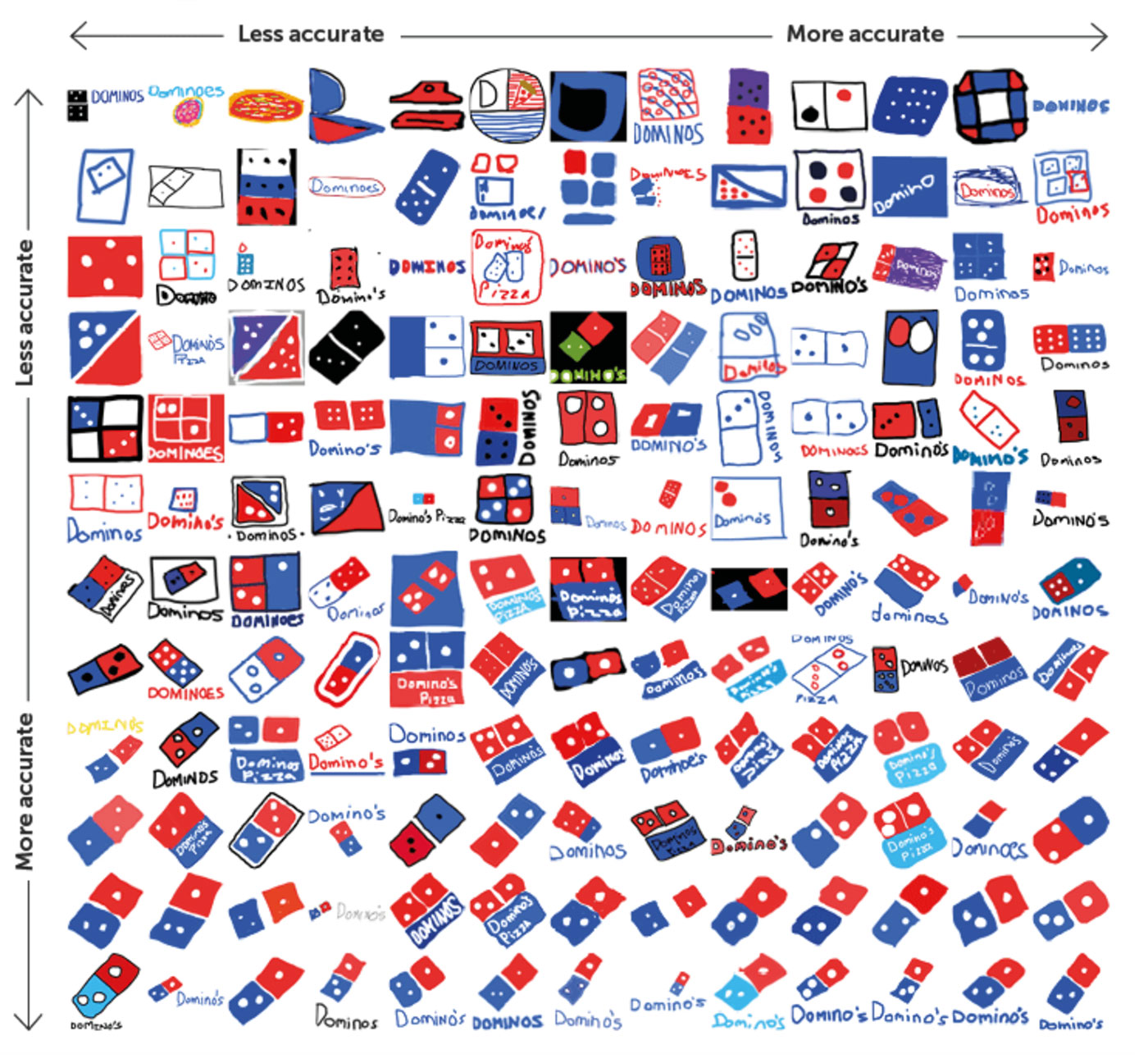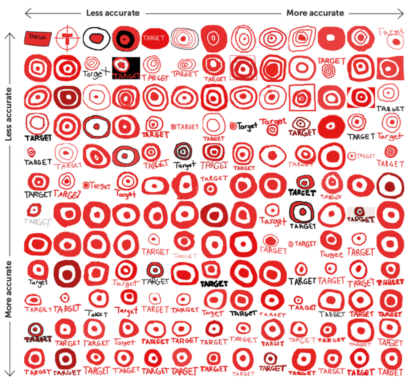
Top-left is least accurate, and bottom-right pretty much spot on.


The remainder are on Branded in Memory, from Signs.com.
Aside from the fact that there surely must’ve been a few graphic designers among the 156 participants, you’ll hardly be surprised that the logos with the most accurate recreations across the board, i.e., from top left to bottom right, are those with the simplest appearance (Target rather than Starbucks).
What’s obvious from the results is that most people are excellent at recalling brand colours — around 80 percent selected the correct palettes for their drawings, while shapes proved harder to recall. This highlights how beneficial it can be to assign logos with colours that are clearly different from competitors. Of course, it’s much easier to reach consensus on an unusual colour when working on a new design rather than something with existing brand equity (sometimes it’s more important to stick with what’s already in place).
While the study conducted was small, it kind of highlights the logo design challenge — to create a mark that can be easily remembered, while distinctive enough to stand out from the competition.
Via Debbie Millman.


Comments
Very interesting study. Thanks for sharing. I’ve always thought that the first thing people typically think of when a brand comes to mind, is it’s logo. It goes to show the power of a strong logo, why it needs to be relatively simple, unique and memorable. A strong logo is much more than a pretty little graphic, it’s an investment that shouldn’t be overlooked.
Crazy experiment! I wish I could see more of these! Sometimes it’s hard to figure out why the discrepancy here is so noticeable.
Love this! What I think is worth noting is that also the HISTORY of the logo sticks in people’s minds. They can update but that beloved original Burger King logo is always going to be a part of their brand.
This is a great example of designing with simplicity. The first element a consumer will likely remember about a brand is its logo.
I love seeing the difference from each sketch but relating to the same concept of the brands logo. Thanks for sharing, David.