


10 Best Brand Guidelines Templates (+Tips) | Visme
Written by:
Orana Velarde

A logo serves as the cornerstone of your organization’s identity. It encapsulates your company values, mission, and offerings in a memorable visual. However, it can be difficult to know where to start or what type of logo to create.
Not all logos are the same. In fact, there are numerous types of logo designs. This begs the question, which one is right for your brand?
In this guide, we’ve collected 14 logo types to help you know exactly what types of logos are the best for your brand and how to use them.
We’ve searched the web, looking at portfolios, websites, branding guidelines, and more to find 14 types of logos. Jump to the logo style that catches your eye, or keep scrolling to see them all.
As brands grow, expand and evolve, so do the variations of the logos that designers come up with. Yes, a combination mark is a great start, but let’s take a close look.
What makes up a combination mark? Why are there so many styles, and what are they called? Why does your brand need more than one type of logo?
In this guide, we’ll answer all these questions and more. At the end, you’ll know exactly what types of logos are the best for your brand and how to use them.
We’ve scoured the web looking at portfolios, websites, branding guidelines and more to come up with the most comprehensive list of logo types in use today.
Additionally, here are some logo design tips to get your creative juices flowing.

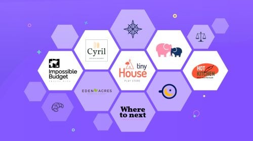
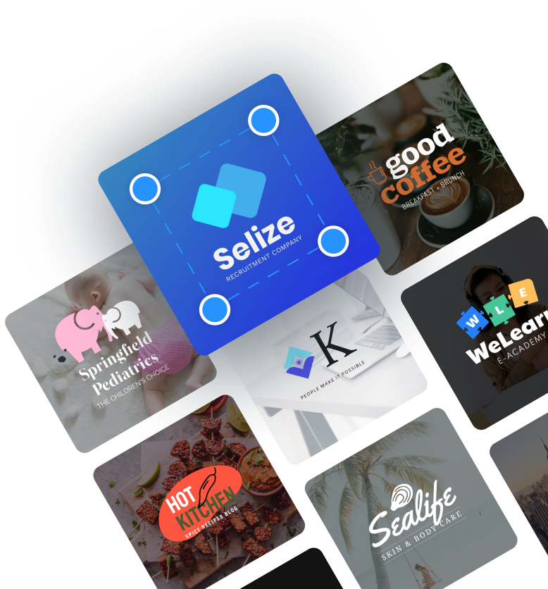
A combination mark logo is a visual and a word in a composition together. You’ll see throughout this guide that there’s no one type of combination mark; they’re actually a combination of many of the others. That’s why these logos are the most common; they have infinite possibilities and are super practical.
In a combination logo, the visual component can be on top, to the side or even below the wordmark. The best combination mark logos are the ones with elements that can be used separately and still be 100% recognizable.
All the logo templates in your Visme workspace are combination marks. The idea is that from that starting point, you’re able to create the variations according to your logo usage needs.
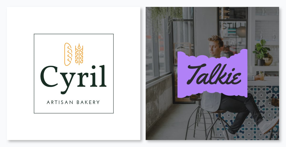
Wordmark logos are second in line when it comes to common uses, and they make up half of almost every combination logo. For a logo to be considered a wordmark its visual must be made up of the brand name in stylized letters.
To create a wordmark, start by writing the name of your brand and then trying it out with different fonts. When you find the font you like, it’s up to you to customize the letters individually. Taking the time to customize the letters in the word is what makes the difference between a logo and your brand name typed out in a nice font.
For example, give the letters a sense of personality; add ligatures, turn the dots on the i’s into shapes, make the t crosses longer, the y’s curvier, etc. Enhance your logo further with the ideal color scheme to give the wordmark character.
If you choose a wordmark logo for your brand, you might not need a combination mark, but you might need a symbol, mascot or letterform for when you require using a smaller version of your logo.
Lettermark logos are the best choice if your brand name is long and composed of more than two words. A lettermark logo minimizes the length by using the initials of each word and creating a group. In some cases, the letters will sound like a word. NASA is an excellent example. NASA stands for National Aeronautics and Space Administration, but nobody calls it that.
Other examples that don’t sound like words, like NPR and TNT, are read as each letter one after the other. Lettermark logos also work as part of a combination mark in the same way that a wordmark can.
When creating a lettermark logo, try using design aspects that will stand out and make your logo more noticeable. Use different colors, varying sizes of text, or add shapes or lines to give the logo personality. Remember to always reflect your brand values and story.
Monograms logos are similar to lettermark logos. But they do have a noticeable visual difference. Both logos use the initials of the brand name to make up the design, but monograms interlace the letters instead of having them side by side or top to bottom.
A monogram is reminiscent of the way a family name is embroidered on linens or etched on silverware. This style of logo has a generalized perception of luxury or exclusivity. Although there are exceptions like many sports teams and some sports brands.
A monogram logo works best with brand names that have no more than three words. Since the letters are intertwined with each other, it needs to stay legible and easy to understand. Choose this style of logo to minimize the variables when it comes to visual branding.
Letterform logos are another type of logo that includes letters. In this case, only one letter. This style of logo is perfect for brands that appreciate simplicity. For a letterform logo to stand out, it’ll need a high dose of personality and form. Just a letter on its own won’t be as memorable.
Brands need logo variables to use on different platforms and touchpoints. A wordmark with a letterform variable covers all the possible eventualities that a logo needs. From business cards to favicons and app icons.
App icons on a phone screen compete for attention. If your app uses a visual that doesn’t resonate with the brand or is hardly recognizable, users will have a hard time finding it. Letterforms are great for app icons.
Symbol logos —also called pictorial logos—are made up of graphics that visually represent the brand name or function. These can be icons, illustrations or shape compositions that are instantly recognizable as something specific.
For example, Twitter used to have a bird symbol. Shell has a shell and Dropbox has an open box. Finding an icon that can visually represent your brand name or brand story is relatively easy. The trick is adding that extra bit of personality—that touch that makes it unique.
That’s how the Twitter logo becomes the Twitter bird, the Playboy logo, the Playboy bunny, and the Apple logo, the apple. These are the easiest types of logos to get right; all you need to do is make yours unique and relevant.
Abstract logos are like symbol logos gone rogue. Instead of visually depicting a brand name or brand story, an abstract logo goes in a different direction. In some cases, it can start off as a symbol and then transform into an abstract visual and other times the abstraction is born on its own.
To create an abstract logo, you need to fully understand the purpose and story behind the brand. You won’t be able to come up with an abstract logo unless you know what story you want to tell. Think of it as a tattoo, you don’t want a logo that has no meaning or story behind it.
Even if your abstract logo has a couple of shapes next to each other, what does each shape represent? What does the composition of the two shapes together mean? Yes, you can make up the meaning of your abstract logo, after all, it’s abstract.
Mascot logos are fun and personable but also limited. Not every brand will benefit from a mascot logo.
How do you know if a mascot logo is right for you?
If your brand story involves a person or a unique personality, a mascot logo might be the right option. Mascots can be illustrated or simplified renditions of the brand’s ideal customer or who the customer aspires to be.
In some cases, the mascot is the company founder or someone that influenced the birth of the brand. In others, it's a fictional character that’s meant to inspire the consumer to be interested and engage. The first mascot logo of this style was the Michel man from Michelin.
Remember, though, having an animal in a logo doesn’t mean you have a mascot logo. The mascot needs to have personality and a story behind it. Take advantage of this angle by using the mascot in merchandise design and product manufacturing, like plush dolls and figurines.
An emblem logo is a contained design that includes all the elements inside an emblem shape. Brands that use emblem logos hardly ever have other logo varieties, but might have simplified versions of the same emblem. These simplified versions are called submarks.
Emblems make great labels, pins, bottle tops, or anything where the logo needs to fit in a small space. They’re also memorable and interesting. An emblem can be as simple as a couple icons and a lettermark inside an interesting shape, or as complicated as a custom illustration with a lot of detail.
Choose an emblem logo if you want your brand to reach legacy levels. A well-designed emblem logo will be timeless, sleek and worth making stickers with. Use text effects to make the words stand out and good contrast between shapes and letters.
Always use your emblem logo as a cut-out to easily place over any background. If your uploaded emblem logo has a background, use Visme’s Background Remover to get rid of it.

Similar to an emblem are the logos that consist of words inside shapes. The difference between the two is the level of complexity. You could say that an emblem is to a combination mark what a letter inside a shape is to a wordmark.
The idea behind this logo style is to give a wordmark—or lettermark—that extra something to make it stand out from the rest. The shape can be anything as long as it matches the purpose and story of the brand.
When considering the letters inside a shape logo, think of what shape could possibly represent your brand. Since the options are infinite, there’s no limit to what you can do. For example, Domino’s Pizza is a domino, and Pfizer resembles a pill. Give your logo a backstory by using a shape that supports it.

Negative space logos are a unique creative option for any brand. The visual idea of negative space is to use empty areas to depict a symbol, shape, or graphic. It can be a subtle effect or a very clear one, that depends on what you’re aiming to achieve.
Generally, negative space logos consist of two visuals, the one that surrounds and the one that is encased. The encased shape is the one denominated negative space. There’s no limit to what shapes you use to create the negative space effect. It can also be a letter and a shape, or even two letters.
For a while, negative space logos were just a trend, now they’re timeless. In fact, in 2022, a negative space logo went viral. A designer used the M of the brand name, cut off a piece and ended up with an animal shape inside the letter. People called him a genius.
A dynamic logo is basically one primary logo that can be adjusted or customized in endless ways. Some dynamic logos, like the logo for the City of Melbourne, change color but keep the shape the same. The logo for OCAD University is more about adding elements onto the foundation design.
Not every brand is broad enough to deserve a dynamic logo. It really only makes sense for a large brand that has enveloped other smaller brands, that reaches a wide diversity of people, or that will be showcased in different places.
The best part of a dynamic logo treatment for your brand is that you don’t necessarily need to start there. As your brand grows and your logo becomes more recognizable, then you can start adding dynamism to it. Add a gradient or a pattern to where it’s usually one color. Make it match other elements around it. Bring it to life.
Give your logo an extra layer of uniqueness by making it three-dimensional. Make the letters of your wordmark pop out of the page, make your emblem look like it’s made of metal, or the shape around your brand name look like a real object.
Creating a 3D logo involves a few specialized design skills. You’ll need to add perspective, shading, doubling up on shapes and some highlights in just the right places. Just like emblem logos, 3D logos will need a flat variation for use on touchpoints that won’t fit a 3D version.
Three-dimensional logos look great when they are flat designs with touches that rick the eye to think it's 3D. But they look even better animated and rendered to look like they really are 3D. Another option is to take your current logo and make it 3D. But if you follow the industry trends, you’ll go in the opposite direction.

Any type of logo can be animated, no matter the style. Why did it make this list then? Because it’s a viable option for your logo combination. Use an animated version of your logo for video intros and outros on YouTube, to the end of your TikTok clips or to the opening title of your explainer videos.
Yes, any logo can be animated, but not every animation will work. If you have no animation experience, best hire a professional that offers logo animations. Ask to see different styles to choose which one works best with your brand.
The best animated logos are the ones that use the organic movement of the original shapes. If the animated pieces don’t flow seamlessly with the shapes in your logo, it will be dissonant and more of a hindrance than an asset.
Your brand is so much more than just your logo. Download this guidebook to learn how to perfect your visual brand and your brand story to connect with your audience on another level.

Because there are so many types of brands! Not all brands—or designers—are the same. And like most other things in existence, they evolve. Trends become commonplace, new ideas turn into legacy, and what once was a unique type of logo is now one more on the list.
You can be sure that with time, the list will grow and more types of logos. Designers and business owners will have more options to consider.
If all this makes you dizzy, just stick to a combination mark, you can never go wrong with that one. You can opt for variations with time as you need them.
The Coca-Cola logo is the most recognizable logo in the world. Statistically, around 94% of the global population knows the Coca-Cola logo. The second most recognizable logo is the multicolored Google logo.
Brands must have different logo styles for different use cases. The exact number isn’t set in stone, but the ideal combination includes more or less three variations. When making a decision, cover all possibilities; from using the logo in its full splendor on a business card to its simplified form in a favicon.
The simplest version of a logo is called a submark. It is used in small dimensions or in designs that require simplicity above all else. If your logo is already simple, you might not need a submark, but if it has a lot of detail, you’ll most definitely need one.
It depends! But the consensus is no less than two and no more than five. Yes, you can get away with one, like with an emblem logo or lettermark,
At some point, you’ll need to adjust the design to fit a touchpoint you hadn’t considered at first. That adjustment becomes your second variant.
For the sake of conciseness, consider all types of logos with a graphic and a letter or word, a combination mark. Regardless of whether the visual is a symbol, abstract or mascot or if the font is used as a wordmark, lettermark, letterform or monogram.
Dynamic, animated, 3D and negative space can apply to any of the other types of logos. That’s why I say that the possibilities are endless.
Your first—and most used—logo is called the primary logo. That said, the ideal—basic—combinations of logo variants look like this:
Start off with a combination mark. Visualizing your brand into a graphic and choosing a font that matches is already a huge step towards a finished logo. From there you can expand the vision into other variations. Maybe in the end you’ll drop the combination mark altogether or keep it as the primary logo.
Here’s a suggestion. After you’re done reading this guide, go ahead and create your logo with Visme.
Yes! You can easily make a logo with Visme. Inside your workspace, you have access to numerous logo templates to get you started. Plus, there are thousands of design elements to help you create all other types of logos you can think of.
If you need help coming up with ideas and logo design styles, use the AI Image Generator and prompt it to create some logos for you. Try the line art output style for the best results but play around with the other ones to get even more inspiration for your logo.
Additionally, use AI to generate images and photos that represent your brand, then edit them with the AI Edit Tools to remove unwanted objects or backgrounds.
Your branding might lean towards a “blanding” approach or maybe you seek a unique and trendy style. Either way, your logo will probably fit one of the logo styles on this list.
Once you have a logo for your brand, plus a font and color scheme, upload it all to your Visme Brand Kit. From there you can create endless amounts of visual material for your brand, from documents to social graphics and beyond.
Design visual brand experiences for your business whether you are a seasoned designer or a total novice.
Try Visme for free

About the Author
Orana is a multi-faceted creative. She is a content writer, artist, and designer. She travels the world with her family and is currently in Istanbul. Find out more about her work at oranavelarde.com