We might not notice how impactful and essential a logo is. Just look around you. Chances are there’s a logo on your shoes, shirt, and just about anywhere else around you. These shapes, colors, and icons, whether on billboards or a tab in your browser, are one of the most important components for a business.
Logos represent your brand, is what your audience identifies you by, and can significantly impact your business. A good logo represents the brand and will set you apart from the competition, reflect your values, be memorable, and work in multiple formats. So what goes into a logo, and what are the different styles you can use?
First, we want to cover what a logo is. It is the text, image, symbol, or combination of these that represents your business. A well-constructed logo digs into your brand story, what you stand for, and your values. When creating your logo, you must fully understand the brand’s needs and how you intend to communicate with the user.
You need to know your options, starting with the types of logos you have to choose from. This article will cover the 15 different types of logos and how to find the right logo for your brand.
15 Types of Logos
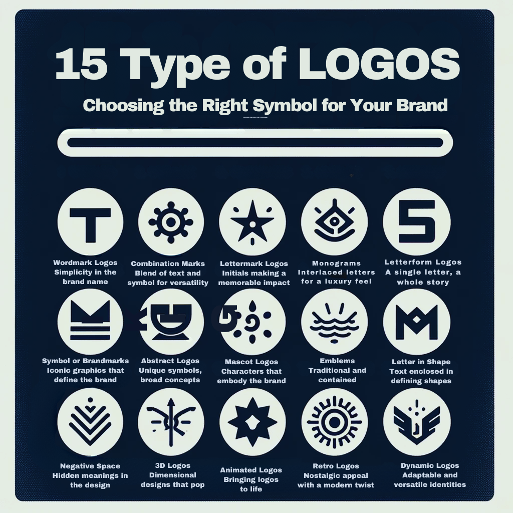
1. Wordmark
A wordmark is one of the most commonly used logotypes; it is made up of simply the brand name. Typically written in a unique, creative font with some design features added.
To create a wordmark logo, start by writing or typing your logo in different fonts. When you find one or a few fonts you like, customize the lettering to create unique and recognizable logo designs. Customizing the letters in the logos is the difference between a logo and your name typed out.
Many of the world’s largest brands use wordmark logos because this logo’s design is straightforward, distinct, and easy to understand.
Any business can turn its brand name into a wordmark logo. However, it works best for companies with names that are brief, distinctive, and easy to remember. You can use a logo maker tool that provides a variety of adjustable templates and graphic elements to create a wordmark logo for your company.
Examples: Google, eBay, and Mobil
2. Combination Marks
A combination mark logo combines a visual element and text; typically, the visual element comes above or next to the name. This is the most common type of logo because there is not one specific type of combination mark. They are a combination of many of these logotypes and a brand name. They have almost limitless possibilities and are very practical for any brand.
The best combination mark logos are the ones that can be used separately and still be recognized. Brand identity, awareness, and recognition improve by utilizing the combined influence of text and images. With combination marks, your business has more ways to get in front of the user and make an impact.
Examples: PayPal, Target, and Spotify
3. Lettermark
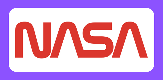
Lettermark logos are great if your brand name is composed of more than two words. A letter mark minimizes the length of your brand name using initials and creating a group of letters that represent your brand.
In some cases, the combinations of letters will sound like a word. Think NASA, it stands for National Aeronautics and Space Administration, but no one calls it that.
When creating a letter mark logo, use design aspects that will stand out and make the logo recognizable. Use different colors, sizes, shapes, etc., to give the logo a personality. But make sure it reflects your values and brand identity.
When you want to condense a long company name with numerous words into a unique design, letter mark logos are a great choice, especially in small formats that might be harder to see.
Examples: CNN, HBO, IBM, and NASA
4. Monograms
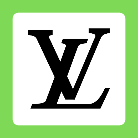
Monogram logos are similar to letter marks but tend to be more straightforward. They do have a noticeable visual difference, both use initials of the brand name, but monograms interlace or overlap the letters instead of having them side by side.
Monograms often have the perception of luxury or exclusivity, but there are some exceptions, like sports teams or sports brands.
Monograms work best with brands that have three words in their name and no more. The logo must still be readable and recognizable despite the letters becoming entwined with one another.
Examples: Gucci, Louis Vuitton, and the New York Yankees
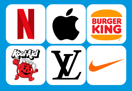
5. Letter form
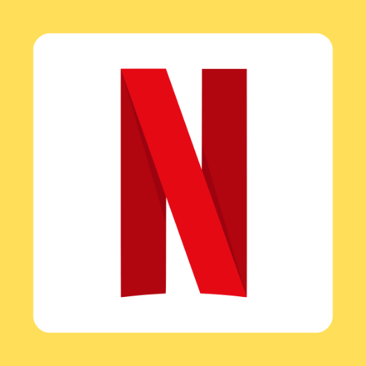
Letterform logos are yet another type of logo that includes letters. But here, there is only one letter used to represent your brand. This design is excellent for businesses that want to portray simplicity, but there needs to be some personality to be effective. A simple times new roman letter won’t do the trick.
When your company’s name is complicated, lengthy, or difficult to remember, a letter-form logo might be the best option. To create this logo, you should incorporate symbolism and what your business does into the initial or letter design.
Another benefit of letterform logos is they make favicons and can be utilized quickly and effectively on social media and other digital marketing platforms.
Examples: Netflix, Unilever, Figma, and McDonald’s
6. Symbol or Brandmarks
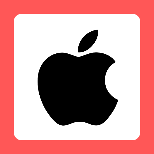
Symbol logos or brand marks are usually what we think about when someone says “logo.” They are made up of graphics visually representing the business or brand name. These can be icons, illustrations, or shapes instantly recognized as your specific business, function, or product.
It’s easy to find an icon that may graphically express your brand name or brand concept. The secret lies in giving it that extra personality-boosting touch to make it stand out.
For instance, Shell has a shell as their logo, Dropbox has an open box, and Twitter has a bird.
Examples: Twitter, Shell, and Apple
7. Abstract
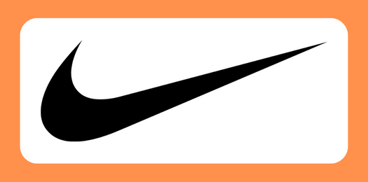
Abstract logos are similar to symbol logos but are a little more unique or “rouge.” Instead of visually depicting a brand name or story, an abstract logo takes a different approach. In some cases, it can start as a symbol and transform into an abstract visual, or other times it can be a random symbol or shape.
You need to understand your purpose and story to create an abstract logo. The best way to create a logo that accomplished your goals is to understand the story you want to tell. You don’t want a logo that has no significance or lacks context.
A corporation can condense its brand into a single, instantly recognized, unique symbol by utilizing an abstract logo mark, with considerably less danger of confusion with a rival’s logo.
In the long run, using an abstract symbol instead of a literal depiction may offer more flexibility, particularly if a company’s focus or product offerings are expected to change.
Examples: Nike, Addidas, and Airbnb
8. Mascot
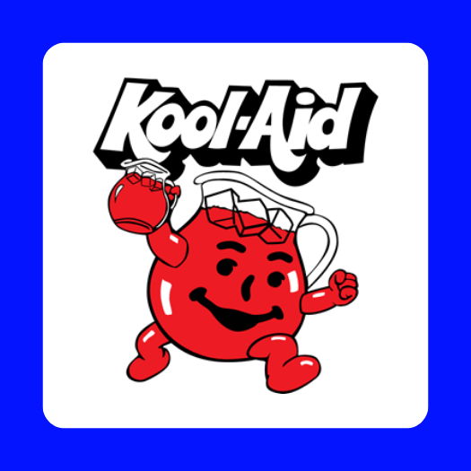
Mascot logos are fun and can give personality to a business, but they can also be limited. A mascot logo will only work for some companies. A mascot logo might be perfect if your brand involves a person or personality.
This could be a fictional character or a famous figure connected to the business, such as the founder. Consider their use in the sports industry to understand the potential value of mascot logos. To represent and communicate that its players mirror those mascots’ strength, power, and grace, sports teams typically employ mascots that are frequently animals.
Additionally, some of those mascots provide entertainment, a fun personality, or a way to remember and recognize the team. These are all benefits a mascot logo can have for your business.
Examples: KFC, Kool-Aid, Planters, and Cheetos
9. Emblems
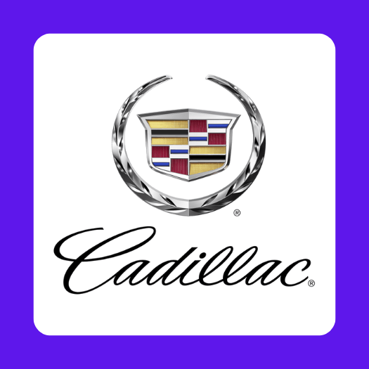
An emblem logo is a contained design that includes a symbol and text inside an emblem shape. Brands that use these rarely have a variety of logos but will have a simplified emblem if needed.
Emblems make great bottle caps and pins and work in any situation where a logo needs to fit in a small space. They can be engaging, professional, and memorable, and they can be just a couple of letters inside a shape or complicated custom illustrations with a lot of detail.
These classic logos can provide a distinctive and timeless design, but this does not necessitate that they look conventional. The modernization of emblems to appeal to 21st-century audiences while taking inspiration from their traditional sources is growing in popularity.
Examples: Cadillac, Harley-Davidson, and the NHL
10. Letter in Shape

Like emblem logos, text and a visual component are included in logos with letters. But unlike emblem logos, letter-in-shape logos are more straightforward; they often consist only of a wordmark and a form that encloses the text.
It gives a wordmark or letter mark something extra to stand out. The shape can be anything as long as it matches the purpose and message of your brand.
When contemplating a logo with letters inside a shape, evaluate what shape could best reflect your company. There is no restriction on what you can do because there are endless options. Use a shape that supports your logo’s backstory to give it a narrative.
Examples: Ford, Lego, Levi’s, and Uniqlo
11. Negative Space
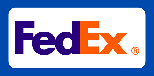
Negative space can be an exciting and unique creative option for any business. The idea is to use the negative space in a visual element or design to show a symbol, shape, or graphic. Depending on your goals, it can be as subtle or prominent as you want.
Creatively utilizing negative space in logos serves as a reminder of how each component of an image contributes to the final product. When creating a logo, it’s crucial to consider where the white space is placed between shapes and text and what message it might represent.
Examples: FedEx, USA network, and Girl Scouts
12. 3D
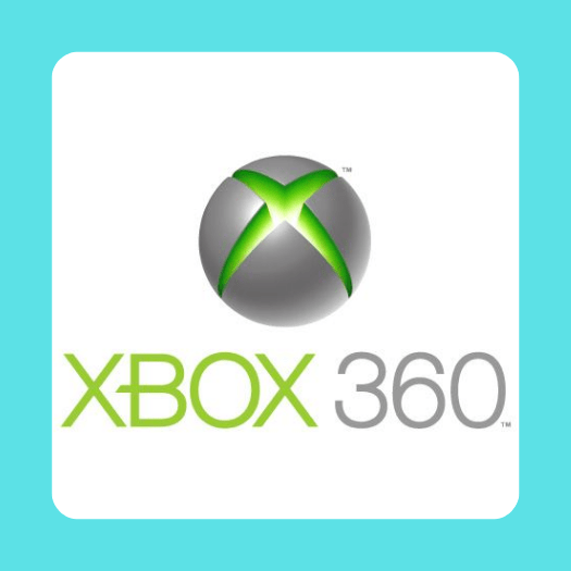
3D logos give your designs an extra layer of flair by making them three-dimensional. It can make the letters pop off the page, make the emblem look like it has a texture, or make the design look more realistic.
You need to add perspective, shading, doubling up on shapes, or highlighting in the right places. But, like emblem logos, you sometimes need a flat logo variation.
In contrast to more conventional 2D logos, 3D logo design stands out and creates a fantastic foundation for animation. 3D logos are the ideal method to catch people’s attention and shout about your business from the rooftops, whether you use subtle shading to create depth or go all out with dramatic graphic animations.
Examples: Xbox 360, Sony Ericsson, and Firefox
13. Animated
![]()
An animated logo can be made from any of the logos on this list. So why did it make our list? It is a variable option or another design for your brand, and you can use them for intros, outros, clips, websites, or anywhere else that your logo can be put into a video or GIF format. It is a flexible alternative or another design for your business.
These days, logo animations are more and more prevalent. Of course, as logo animation grows in popularity, more and more firms will require it to stay competitive. Therefore, understanding how to animate a logo could give your logo something extra.
Animating a logo also has an undeniable element of enchantment, and it is a wonderful way to give anybody who encounters your brand a visual treat. Thankfully, animation software has advanced to the point where virtually anyone, regardless of skill level, can add a little of that flair to their logo.
Examples of animated logos are everywhere; think when you open Netflix or see the Walt Disney Pictures intro.
14. Retro
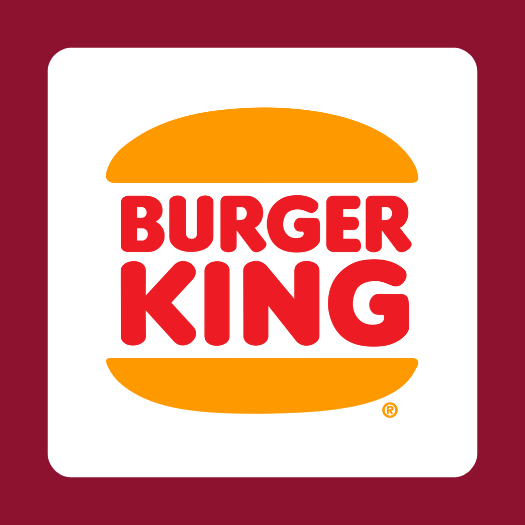
A retro logo works with nostalgia and incorporates past design styles to give your logo a feeling like it is from past eras. This can work well depending on the fonts and styles you use.
Most companies that use this type of logo have been around for a long time and can take their brand image back to the past by using 70s, 80s, or 90s style designs. It can be a great way to create a unique logo that connects with your audience.
Examples: Burger King’s new logo, Whistler Bottling Co., and Feeling Swell Clothing Company
15. Dynamic
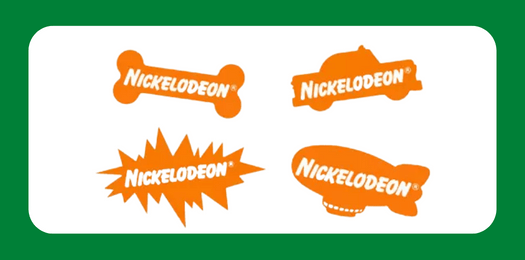
A dynamic logo is a primary logo that can be changed or customized to show different things. They can change colors or shapes to create engaging designs for your users.
Every time the logo is used, it might alter somewhat (such as how an icon is oriented or where specific colors are placed) or get a complete makeover. Dynamic logos can be used in every format while still being recognized and reflecting your brand.
It’s crucial to remember that your logo’s fundamental components should always stay the same. There should be consistent aspects so that your brand can be recognized, whether it be the font, emblem, or color scheme.
Examples: Nickelodeon, Nike, and AOL
How to Find the Right Logo for Your Brand
Choosing your logo is a critical decision that should be considered, no matter what logo you choose. One of the best ways to validate a design, decide between your options, and find the logo you and your target audience love is by running a logo test.
Logo testing is the process of presenting your target audience with a logo or multiple logo options and asking them for feedback on your design. It allows you to understand user preferences and opinions and gauge the effectiveness of your options to measure the appeal, uniqueness, or effectiveness of the designs. When you test company logos or test logo options, you will find what works, what doesn’t, and what needs adjustments in your designs.
Now that you know about all the different types of logos and the best method to help you decide on the right logo for your business, you’re ready to start testing them. Here are the steps you need to take to test your logos with Poll the People.
Step 1: Pick A User Testing Platform
Poll the People is a fast self-service platform that lets any company deploy a logo test within minutes. The tests are designed as quick 1-question tests and completed in less than 60 minutes.
With a self-service system and a free signup, users can get feedback on their logo quickly and easily. There is no need to design your own survey. Just use the logo template, and your responses will be rolling in within minutes.
Step 2: Design Your Test
The next step is to set up the logo test; the whole setup process is less than 5 minutes.
First, log in to the Poll the People, click “create a test,” and select the logo test template.
While you can test any logo you want, it’s best to choose the designs you’re already confident in based on positive feedback from the team, coworkers, or others who have seen the design. To get the best feedback possible, choose designs that are in similar stages of development. If you are testing a finished logo against one that you’re still working on you already know which one will win.
To design a manageable test for you and your respondents, it’s best to test in an A/B format or get feedback on a single design.
Once you identify the stimuli you want to test, create a test question that will answer any questions you have about the logo. Keep it simple: “Which logo do you prefer for an electronics store?” Or “Which logo do you prefer?”. You can test for appeal, believability, purchase intent, relevance, and more.
Your logo survey question will help you achieve the goal of your test. The logo question you ask will be reflected in the feedback, which is what the participants will respond to. Whatever you are testing for, ensure the metric is communicated in your test question.
Step 3: Choose Your Audience
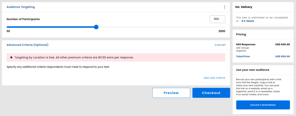
The best way to determine real user preferences, appeal, or engagement with your logo designs is to have your target audience look at them. With Poll the People, you can identify the number of responses you need and add segmentation options to get feedback from the target user.
Set the number of panel respondents; for most logo tests, about 100 responses are enough for statistical significance. If you need more confidence and less margin of error, you can increase the number of responses. We have a panel of over half a million users; choose the number of responses you need to feel confident in your logo.
This option is faster and more cost-effective than a focus group or moderated test, and you will still get insightful responses that help create a great logo.
Step 4: Launch
Review your choices and checkout. That’s it. You are done with the entire setup process in less than 5 minutes.
Now sit back and watch the responses roll in within minutes—no more waiting for hours, days, or weeks for results.
Step 5: Analyze The Results
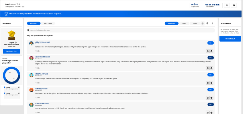
After you’ve gathered your responses, you’re ready to analyze the feedback.
The first thing to look at is: Who won? And by what margin? The greater the margin, the greater your confidence in your choice. In your results dashboard, you will get quantitative and qualitative feedback that will not only tell you the winner but will also tell you what makes a logo good or bad.
Each respondent has to provide a clear explanation as to why they made their choice. Remember to review every response to your question and take a deep dive into the feedback.
You can download, share, and collaborate on the feedback and find the most valuable responses. A word cloud, segmenting the feedback, and taking the time to find the most important responses will help you create the best logo for your business.
FAQ
1. What Are the Different Types of Logos and Their Characteristics?
There are several types of logos, each with unique characteristics. Wordmark logos, for instance, consist of the brand name in a distinctive font. Symbol logos use an image or icon to represent the brand, while combination logos blend text and imagery. Each type of logo has its strengths and can be effective depending on the brand’s identity and target audience.
2. How Can I Design a Simple Yet Effective Logo?
Designing a simple yet effective logo involves focusing on the core elements of your brand. Start by defining your brand’s personality and target audience. Then, choose colors and fonts that reflect these aspects. Keep the design simple and avoid unnecessary details. Remember, the most effective logos are often the simplest.
3. What Makes Symbol Logos Unique and How Are They Used Effectively?
Symbol logos are unique because they use imagery to convey a brand’s identity. This can make them more universally recognizable, as they don’t rely on language. To use a symbol logo effectively, choose an image that is distinctive and meaningful to your brand. It should be simple enough to be recognizable at a glance, yet unique enough to stand out from the crowd.
4. How Can I Find the Right Logo for My Brand?
Finding the right logo for your brand involves understanding your brand’s identity and how you want to communicate it to your audience. Consider your brand’s personality, values, and target audience. Then, explore different types of logos and choose the one that best represents these aspects. You might also consider getting feedback from your target audience through a logo test.
5. What Are the Best Practices for Choosing Between Different Logo Types?
When choosing between different logo types, consider your brand’s personality and how you want to communicate it. Wordmark logos can be effective for brands with a unique name, while symbol logos can be great for brands with a strong visual identity. Combination logos offer the best of both worlds. Always keep your target audience in mind, and consider getting feedback through a logo test.
Conclusion
No matter what type of logo you choose for your business, remember that mindful design will elevate your brand and ensure that customers will remember your logo. A good logo will build a positive association with your logo and brand, adding value and trust to the business.
Now that you have all the knowledge you need to create and optimize the ideal logo for your business, it’s time to create it. Once you have your ideas, concepts, or prototypes, sign up for Poll the People and launch your logo test in minutes.
- How To Retain SEO Ranking After A Redesign - February 22, 2023
- Ultimate Guide: How to Write Brand Names - February 17, 2023
- 10 Best Practices for Using Video in Your Email Marketing Campaigns - February 8, 2023


budget bridges
Brighter Loans is a lending service that provides payday and installment loans from $100 to $5,000 with low-interest rates and flexible terms.